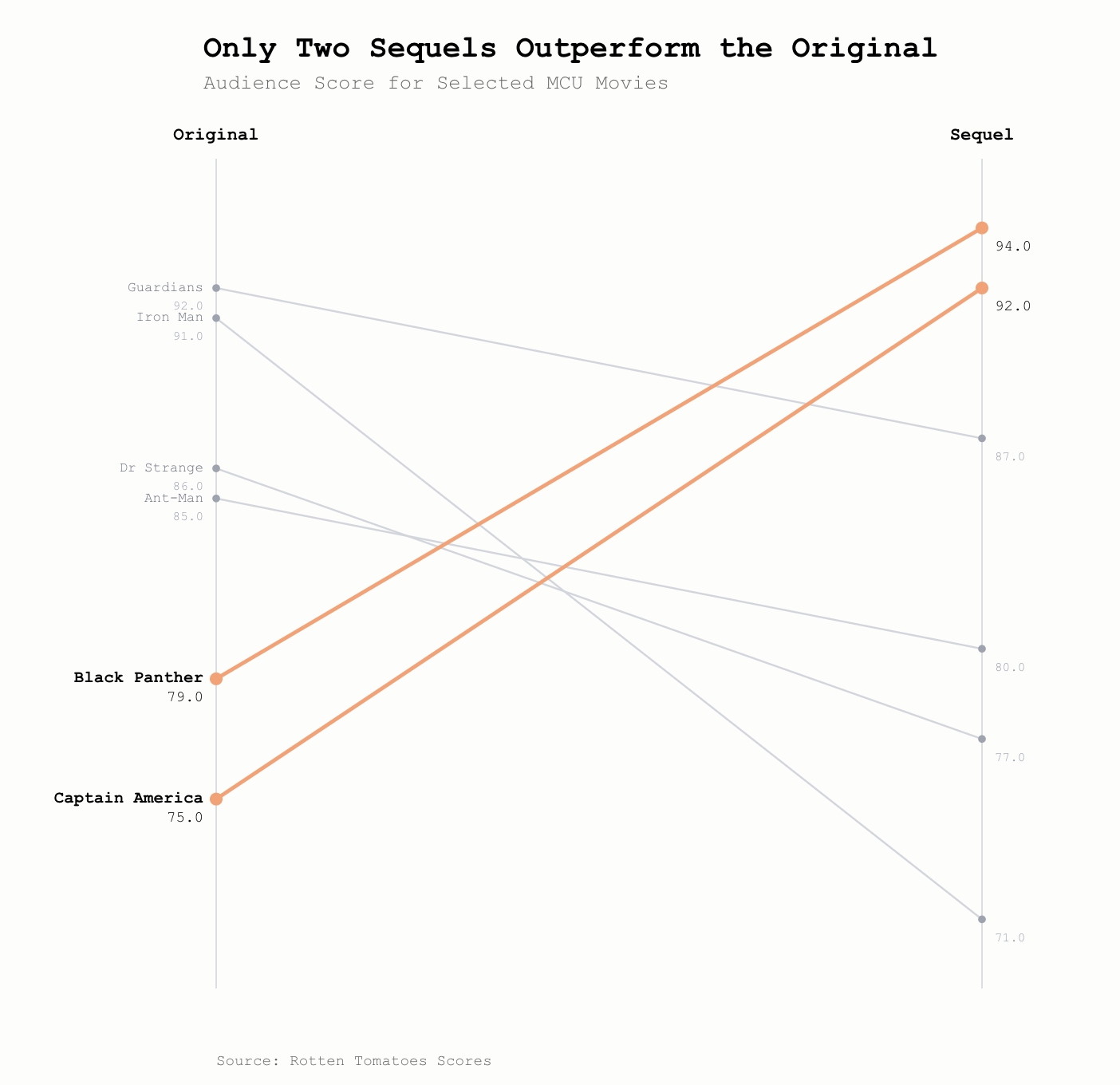
Slope Chart
A slope chart is a unique version of a line chart that is highly effective at showing simple changes in values / performance etc. between two set time periods or categories.
They are often used to show dramatic changes or outliers that run counter to most other series.
A slope chart has the opening state (or first category) on the left y axis, and the closing state (or second category) on the right y axis.