Introduction to Data Visualisation
In any data based role, the importance of simple, effective and impactful data visualisation is becoming more important than ever.
Data visualisation is everywhere: in the reports we read, the stories we watch, even the bills we pay. And as it becomes more central to how organisations communicate, it’s quickly turning into a core skill that can shape your impact and your career. Yet getting started can feel overwhelming — what charts should you use, what do they actually show, and how do you choose the right one for your message?
This course breaks it down simply and clearly. You’ll explore the most common visual types, understand when each is most effective, and learn how to make choices that bring clarity rather than confusion. Whether you're new to working with data or looking to strengthen your storytelling skills, this introduction gives you the confidence and foundation to visualise data with purpose.
Is the course relevant to me?
If you’re at the early stages of your Data Science career, or if you’re simply looking to expand your Data Visualisation Toolkit, this course is a great introduction into the variety and power of different charting techniques.
This course will give you a thorough grounding in the role of Data Visualisation and will help increase awareness and confidence of the different charts you can use as part of your data stories.
The course is designed for individuals that are comfortable with data and require the use spreadsheets and reporting in their daily work.
What Topics do we Cover?
Introducing Data Visualisation
- What is Data Visualisation?
- What role does Data Visualisation play in our roles?
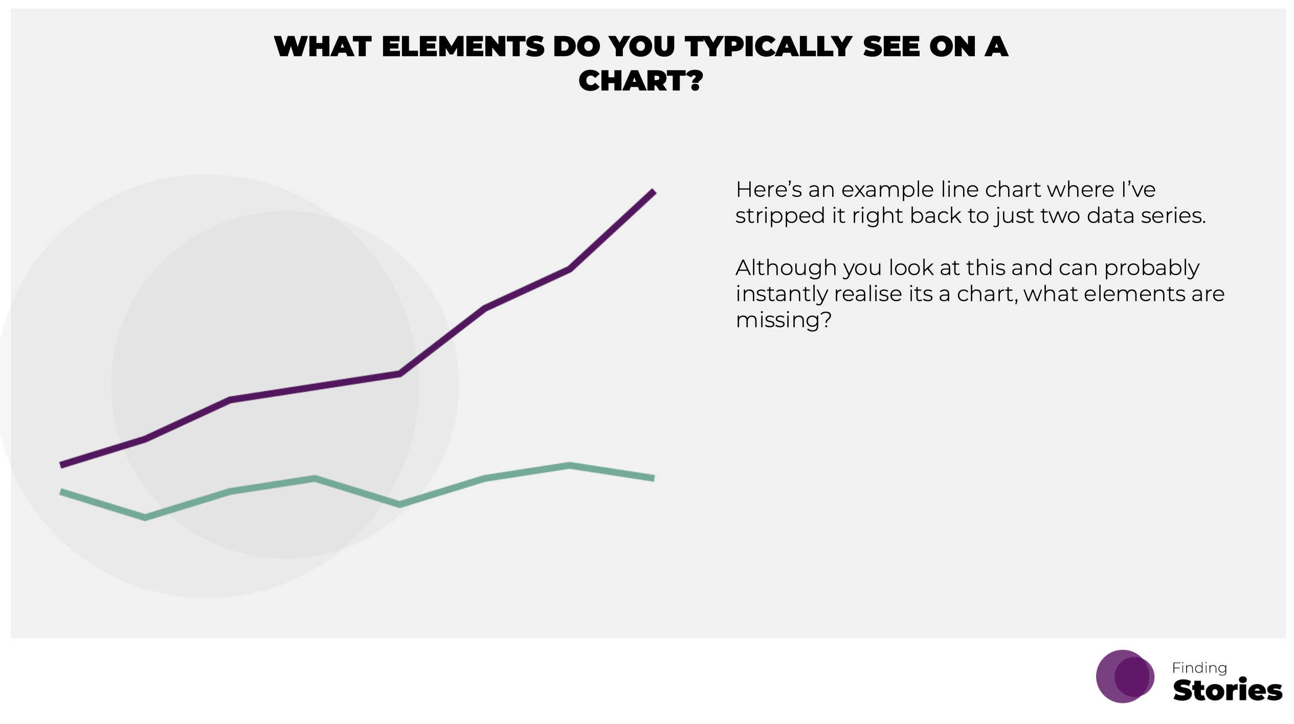
- Introducing the different elements that make up a chart.
Portfolio
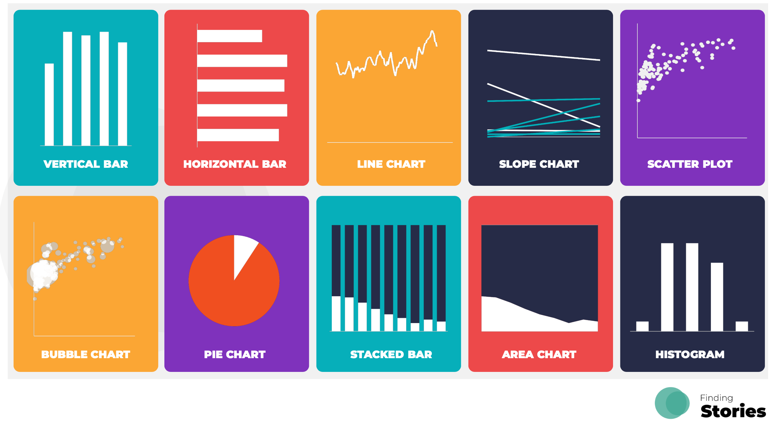
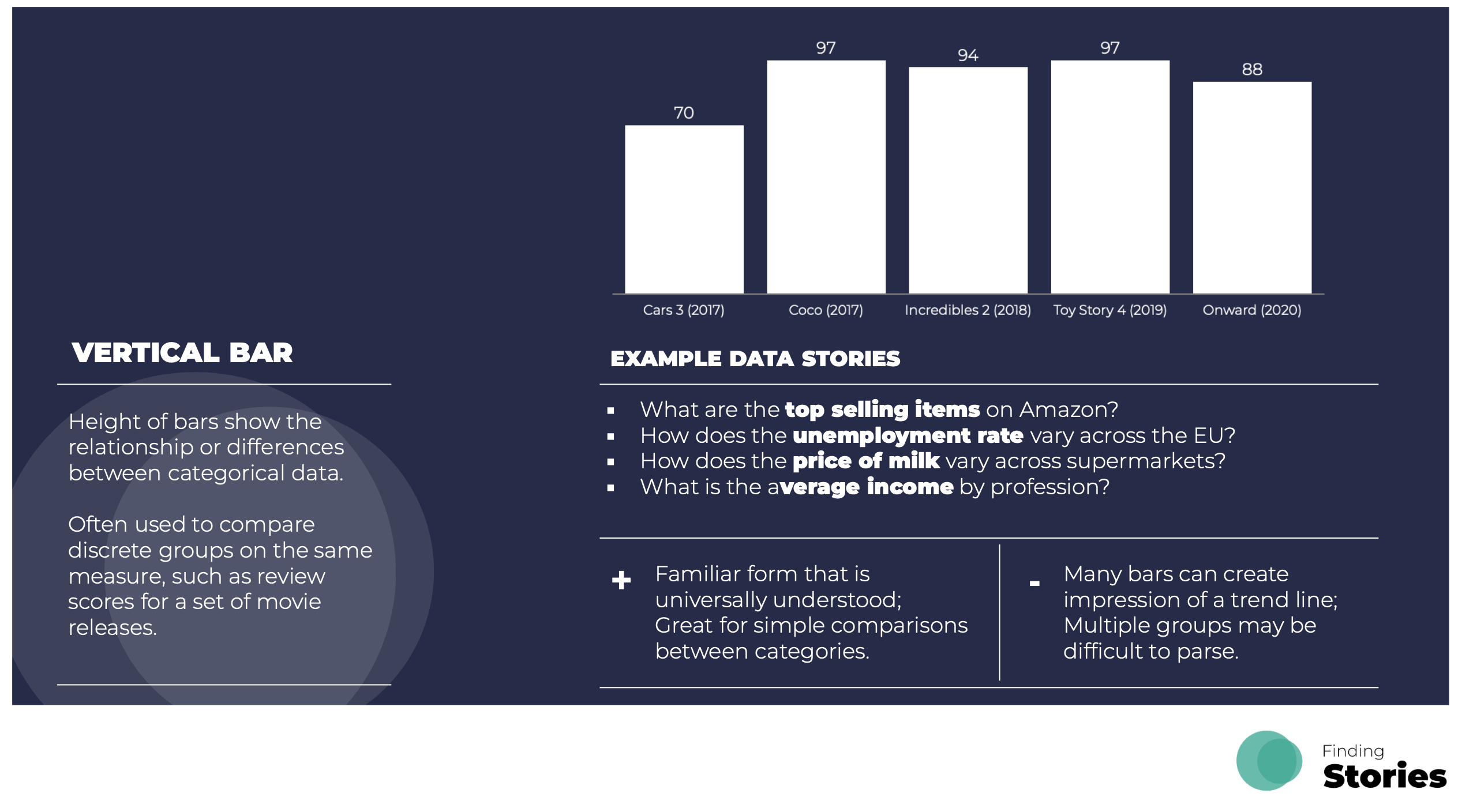
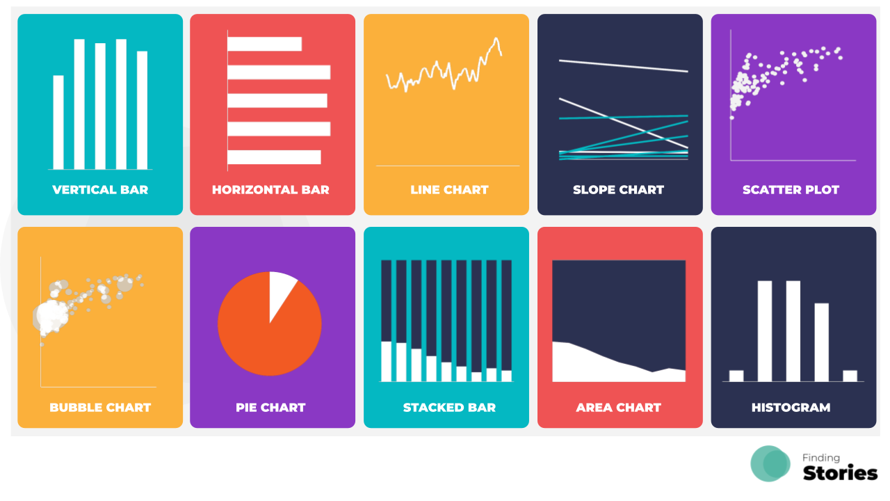
- A walkthrough and practice of 10 core chart types.
Presentation
- Three key principles on how to maximise the persuasive power of your visuals.
Want to Find out More?
Cost Details
For more details about the price of this individual course, or if you want to combine it with other courses, please take a look at our pricing page here.
Selection of Slides from the Course.