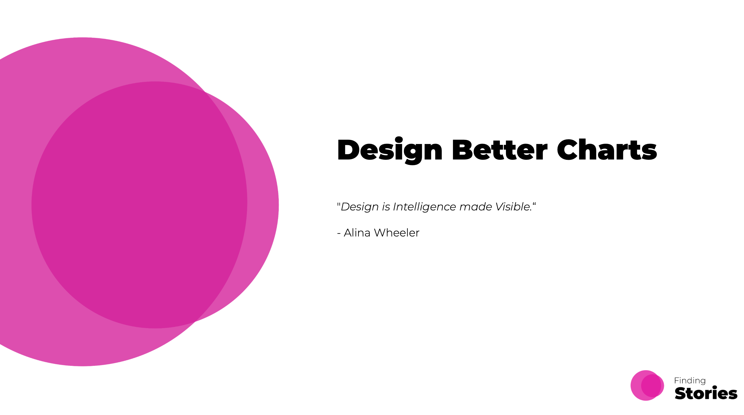
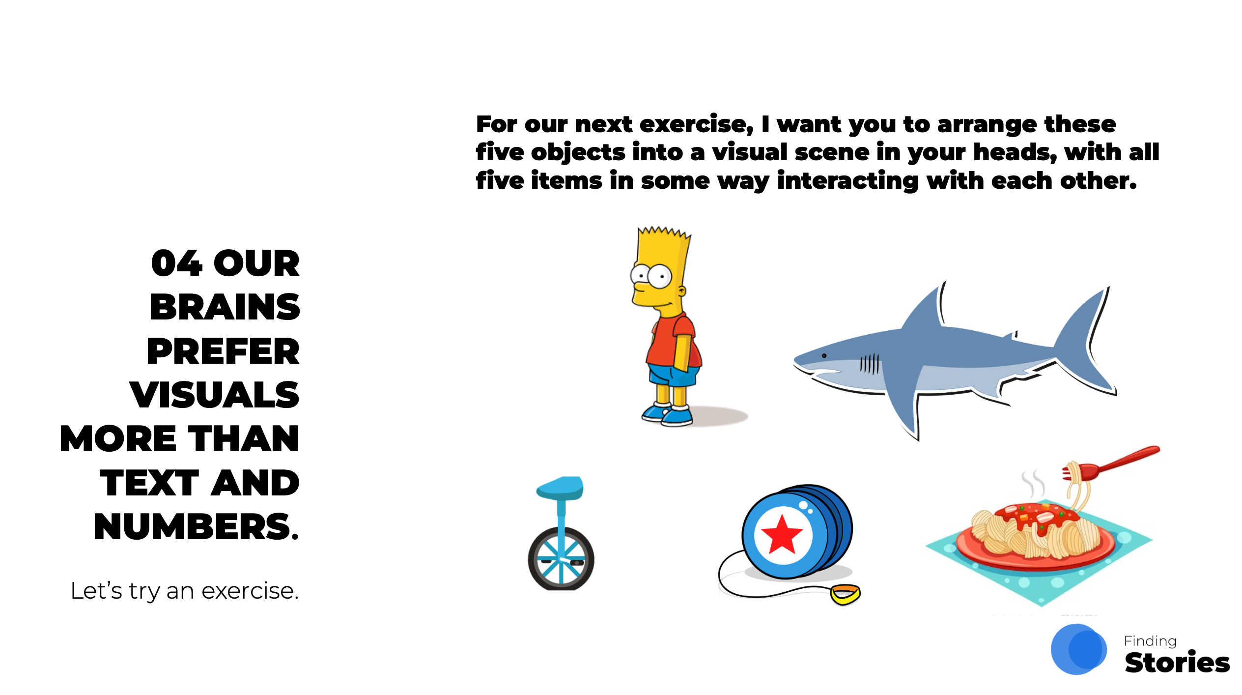
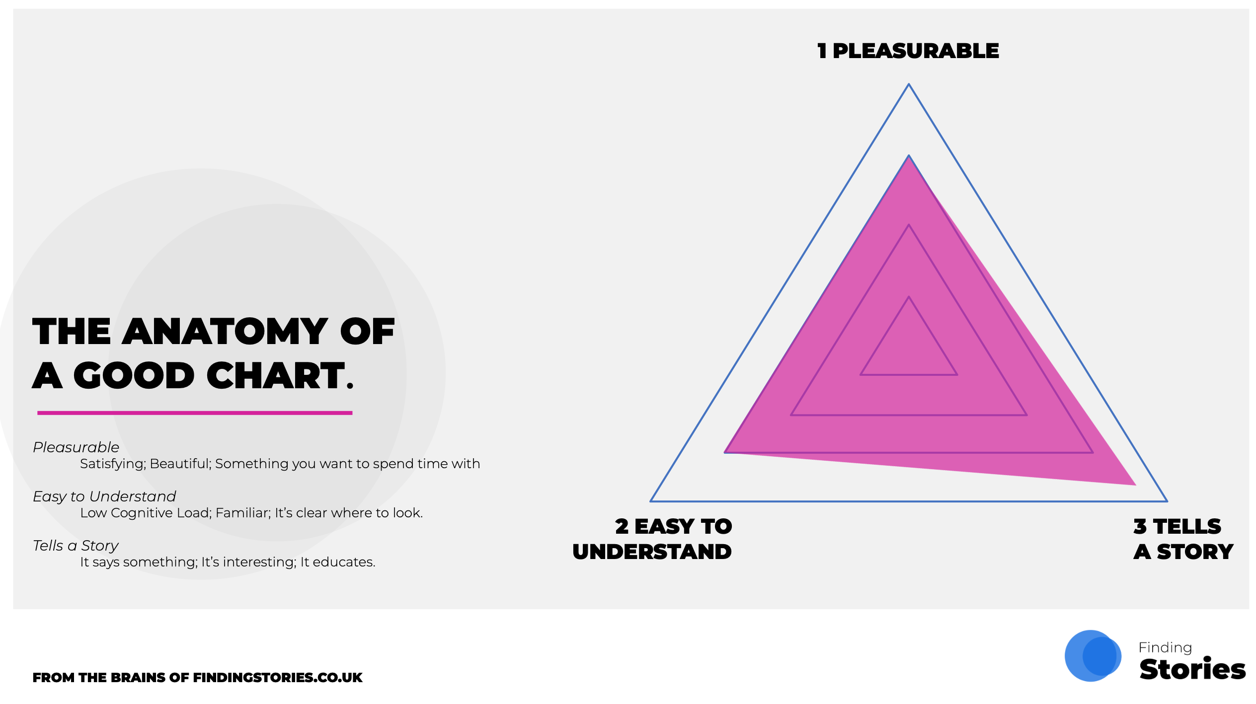
Design Better Charts
Being great at Data Visualisation is becoming an increasingly important skill in Data Science and this course will help you raise the bar and become more confident in telling data stories that both inform and engage.
We’ve all sat in presentations, watched the news, scrolled through our Socials and found ourselves remarking “that’s a great chart” or “what on earth is that(!)” when looking at other people’s visualisations. Data visualisation is now everywhere, and as a result it’s becoming more and more important that we get it right and get people engaged with the story we are trying to tell.
We are not underplaying it to say that a good chart can make the difference between a successful project and one that fails to land.
Our course is designed to get you thinking about ‘what makes a great visualisation’ and what are the Design Principles you can apply each and every time to achieve this. The course will also share how you can go about approaching the production of Data Visualisation in a more systematic way that will elevate your end product and ensure you inform, inspire and ultimately entertain your audience.
Is the course relevant to me?
If you find that your presentations are full of ‘the same old visuals’ or you’re finding that you are having to take the time to explain your charts, rather than your story, then you may need help with visualisation design.
Alternatively, if you simply want to find that next 10-20% to elevate your charts to the next level then this course will be for you.
The course contains models, examples and best practice to help you become more confident with Data Visualisation Design and ultimately have more influence with your data stories.
The course is designed for individuals that are comfortable with the typical range of chart types that you can find in products such as Microsoft Excel, and are confident in choosing the right chart type for their data.
Individuals who use data visualisation to tell data stories and/or need visualisation to explain complexity are most likely to benefit from this course.
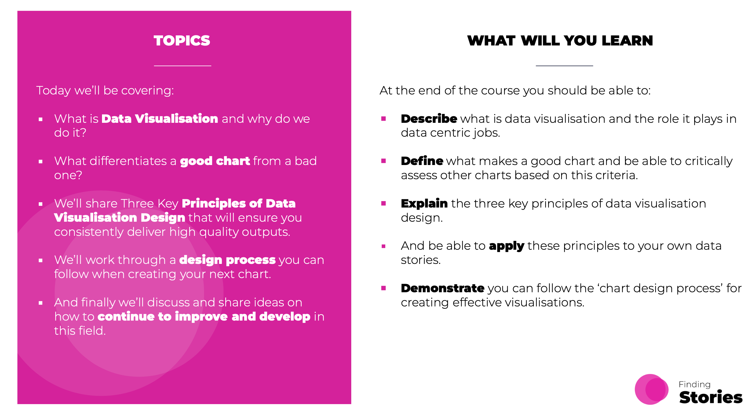
What Topics do we Cover?
Evaluation
- What is Data Visualisation?
- Why do we do it?
- What makes a great chart?
Design
- Introduction to three key principles of data visualisation design.
- With a thorough exploration of each.
Approach
- Introduction to a 4-stage process to creating your own visualisations.
- How to challenge yourself on whether they achieve great design.
- Ideas for the future to continue to elevate your outputs.
Want to Find out More?
Cost Details
For more details about the price of this individual course, or if you want to combine it with other courses, please take a look at our pricing page here.
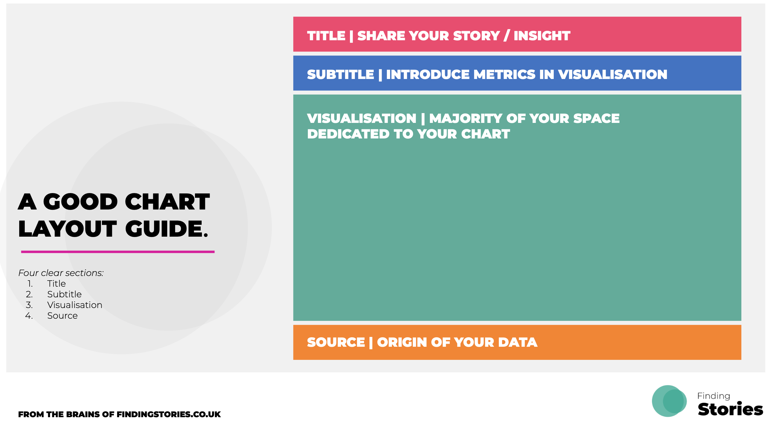
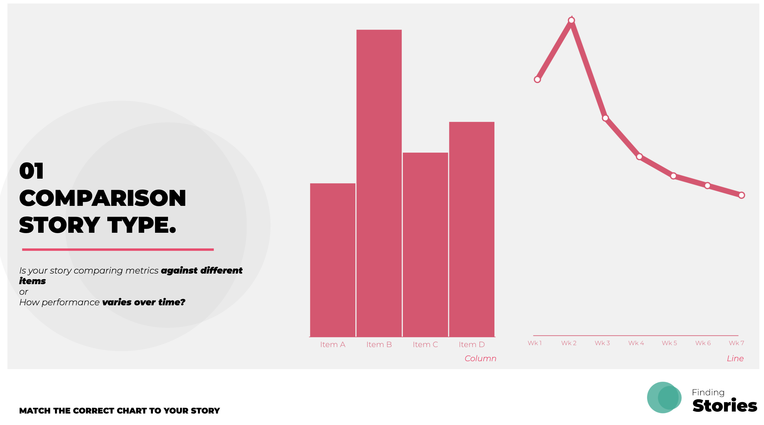
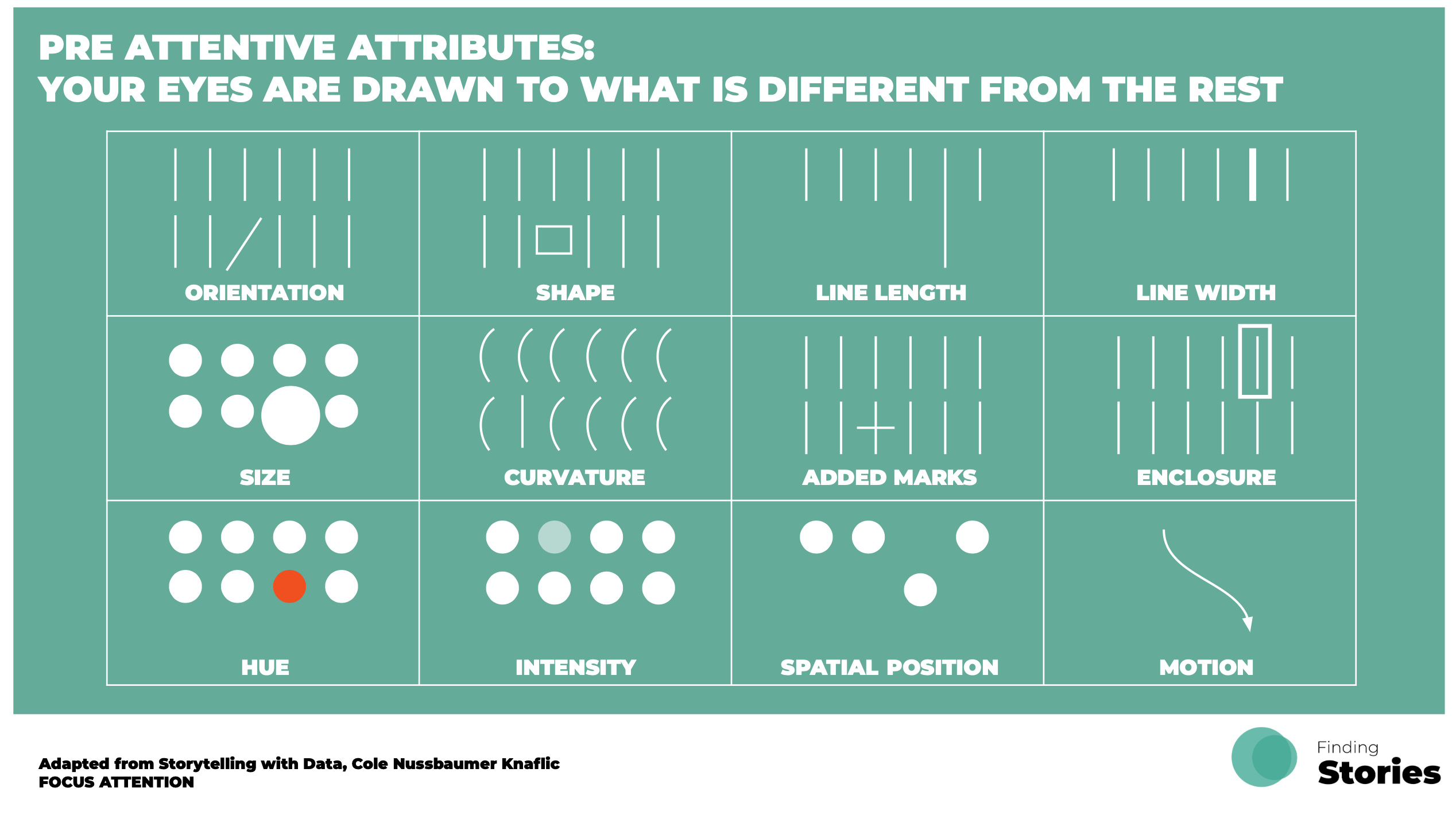
Selection of Slides from the Course.