1 Simple Stories
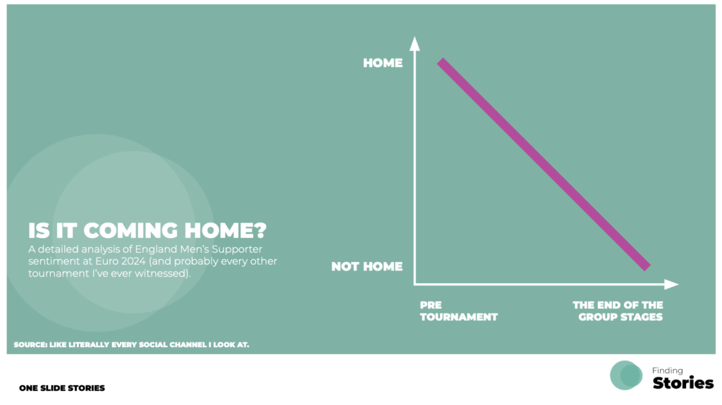
I’m a big fan of simple, bold visual designs to tell a data story – they’re great for grabbing attention, while still having something to say…even if it’s just light hearted. They are designed so that it should be relatively quick to process, understand and appreciate. These visualisations tend to take less time to create too. Win, win. Here’s a few recent personal examples .
Euro 2024 Sentiment Analysis
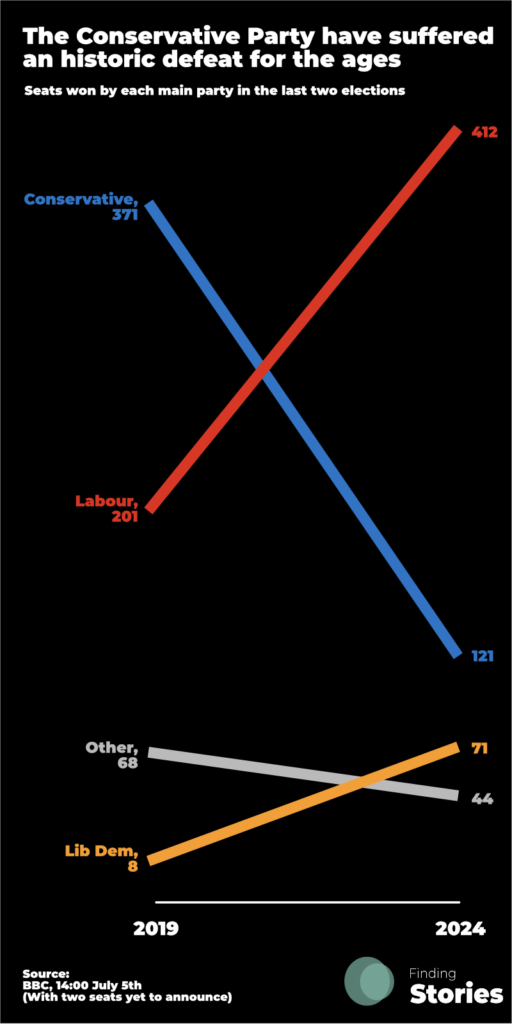
UK Election 2024 Result
Today’s Story
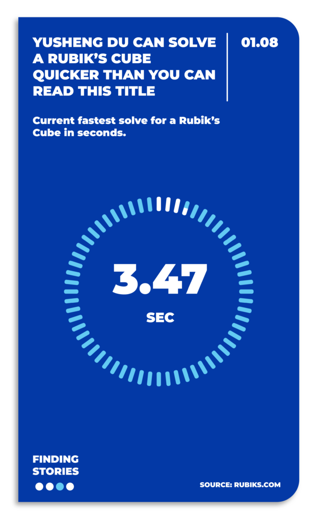
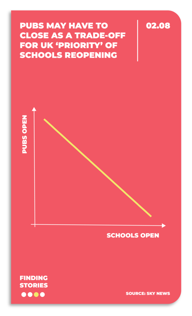
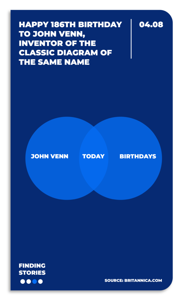
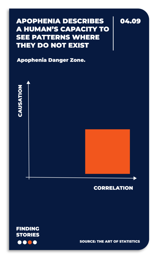
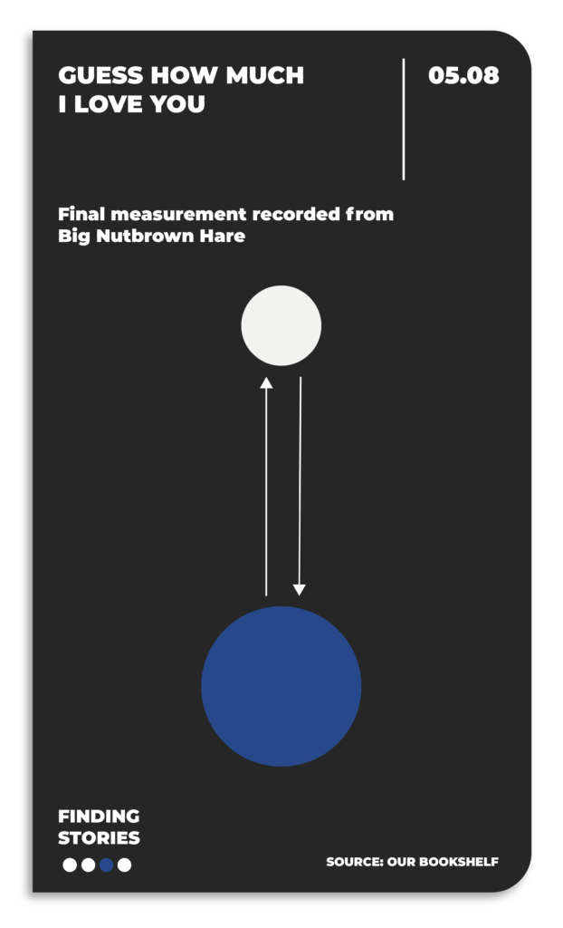
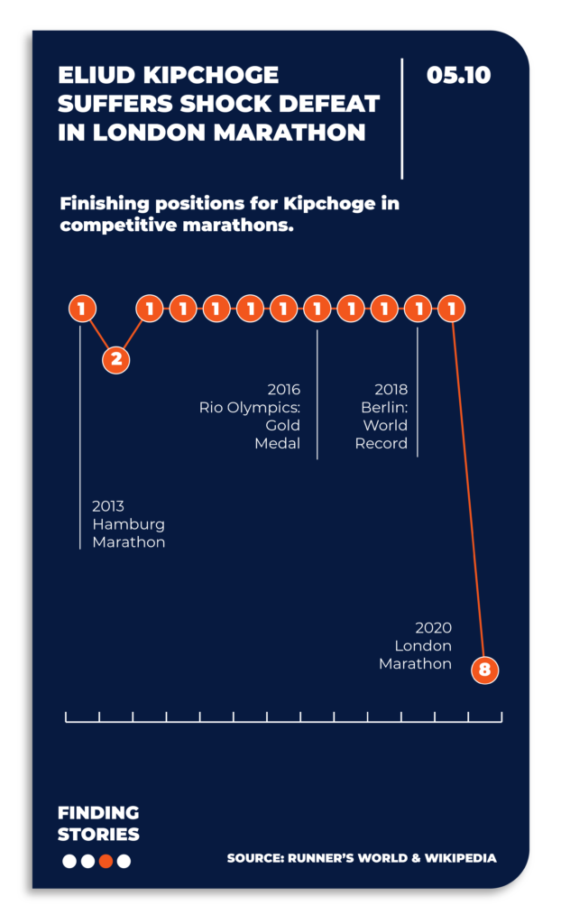
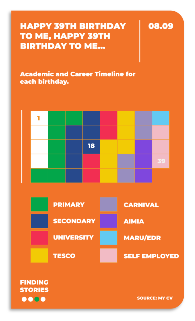
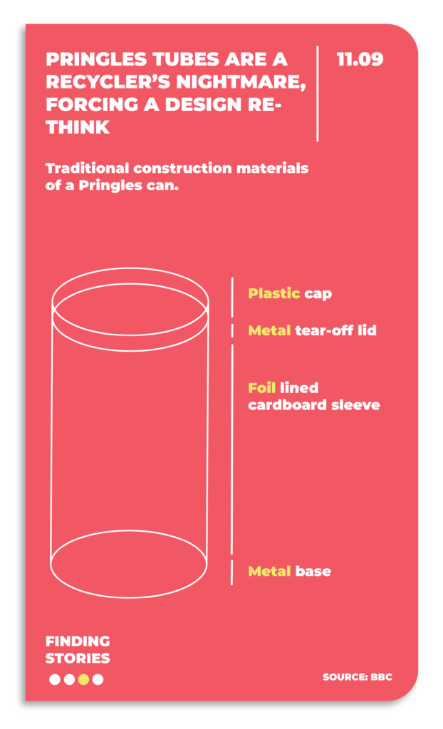
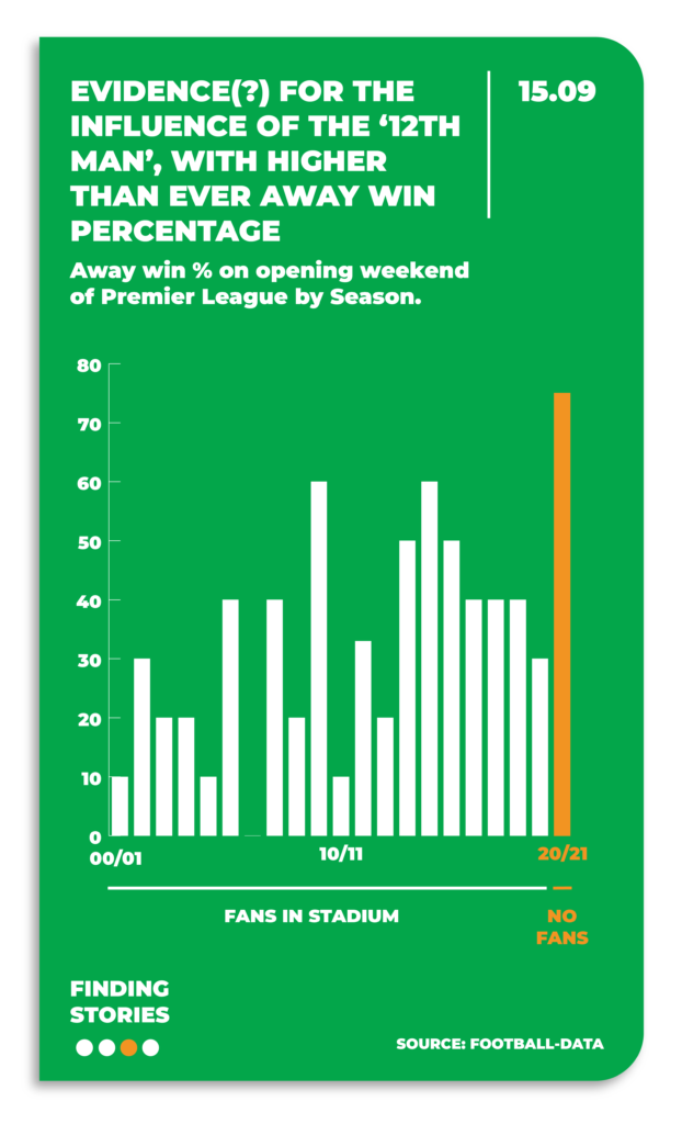
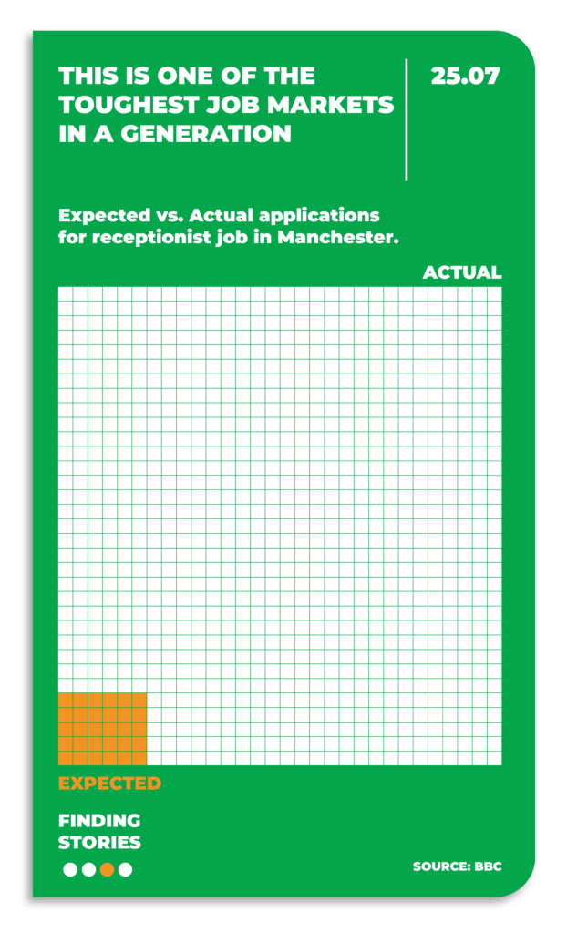
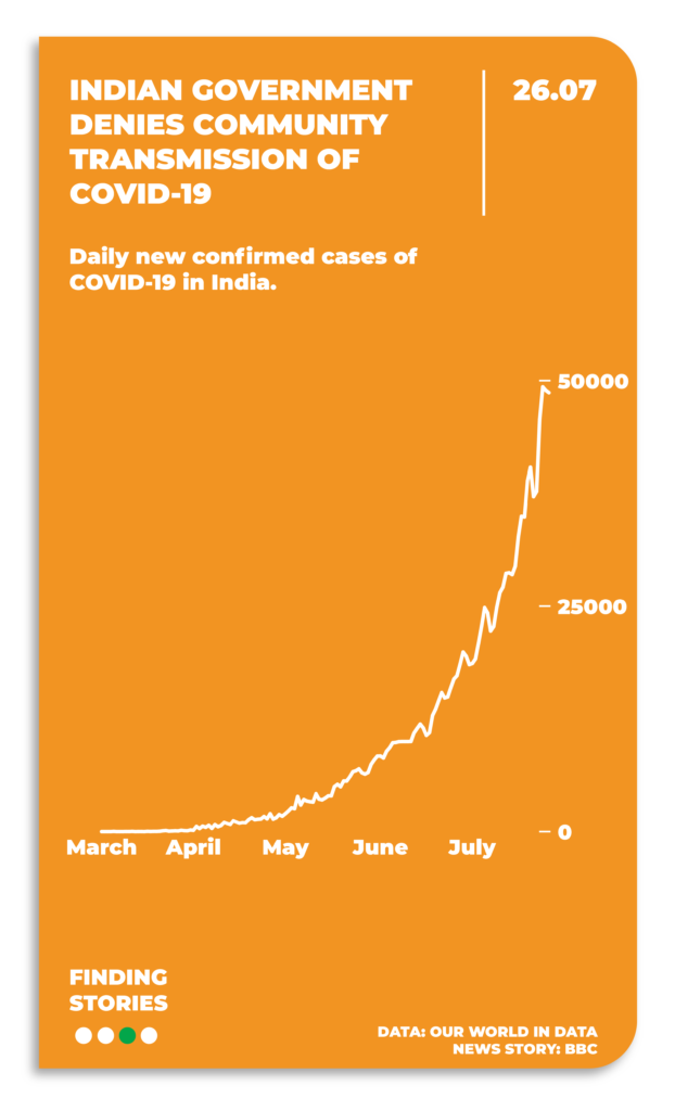
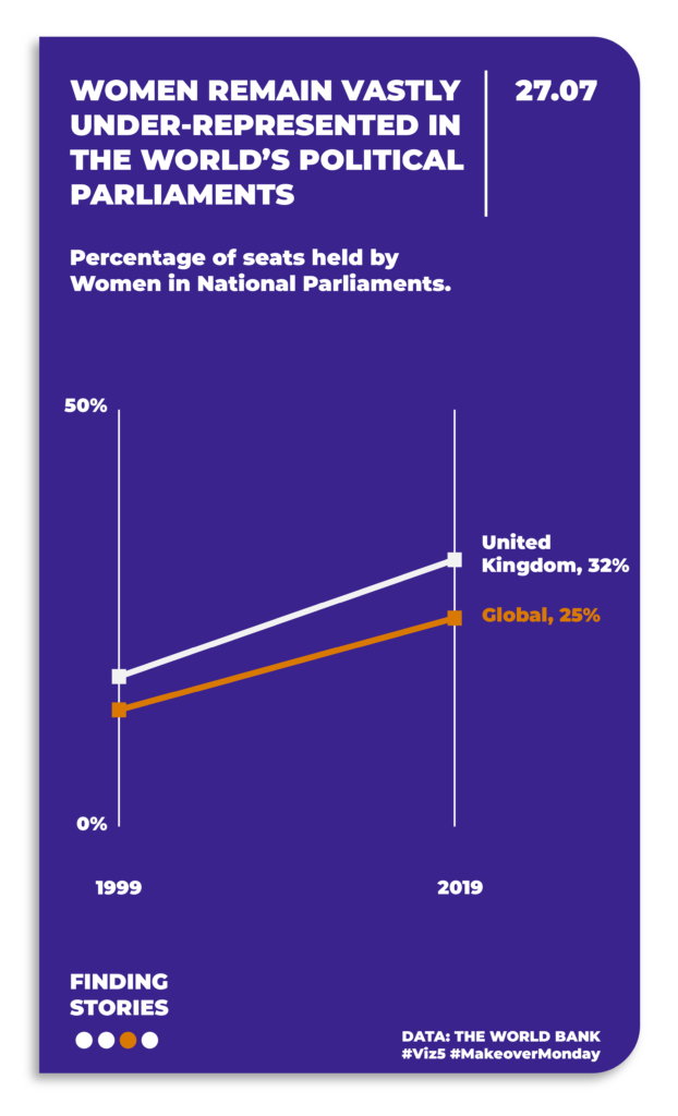
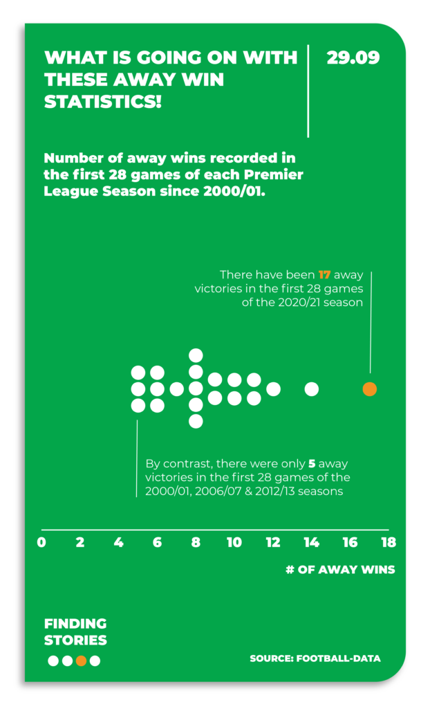
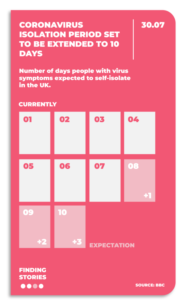
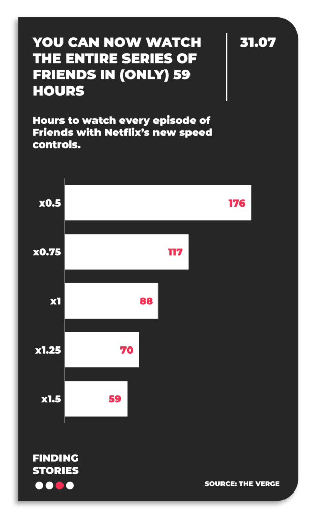
Back in 2020, I gave myself the challenge of creating some simple Daily Stories. My brief was to find a story in the news / something I’d recently seen and create a simple chart of it to bring the story to life through visualisation. Here are some examples:
(Note. these visuals were created during Covid Lockdown, so quite a few references to that and the stories around it).
2 Long-Form Stories
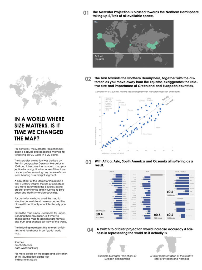
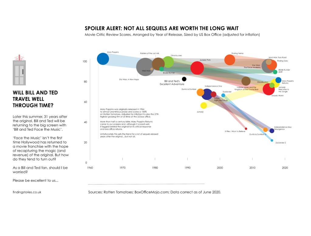
Similar to the above, but the examples below go into a bit more detail and narrative about the individual topic and are designed so that the user spends a bit more time exploring an individual topic.
Change the Map
Sequels
3 Business Stories
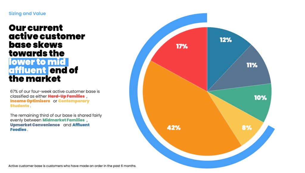
For most of us, the visualisation stories we create will be used in the business context: How are sales trending up or down? Who are our customers? When is the right time to launch a new line? Etc.
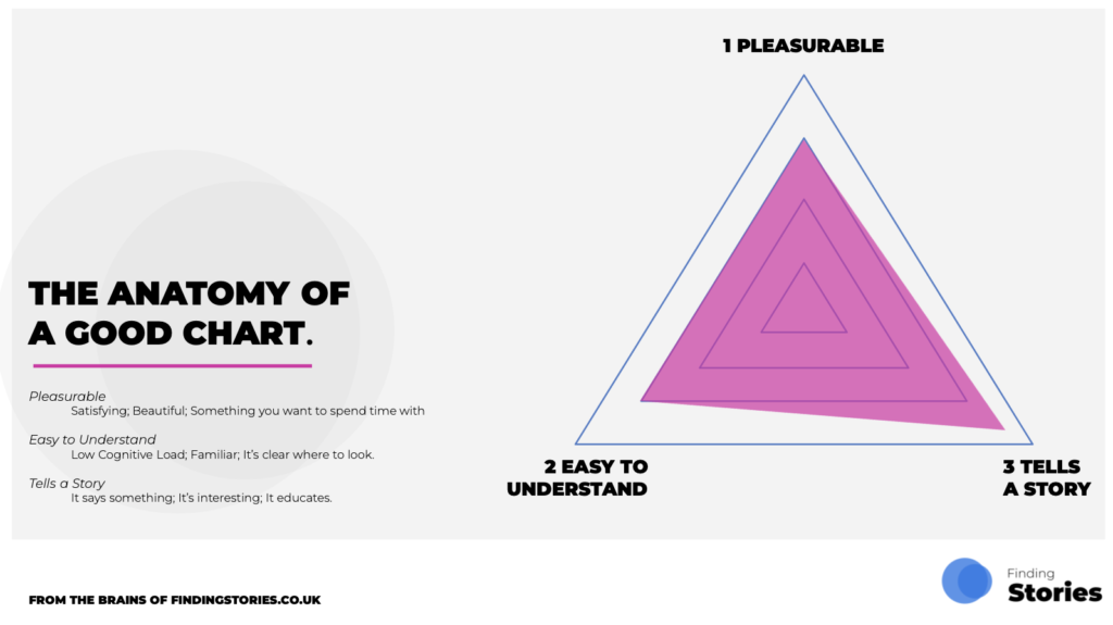
My aim when creating data visualisations in my business work has always been to tell a story, make it easy to understand and make it pleasurable – three key facets of what I believe make up the ‘Anatomy of a Good Chart’:
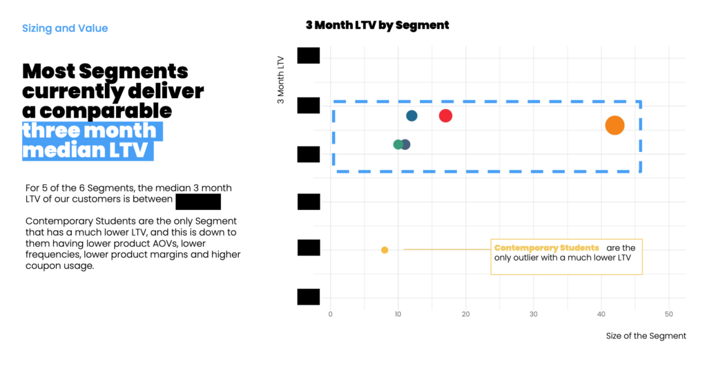
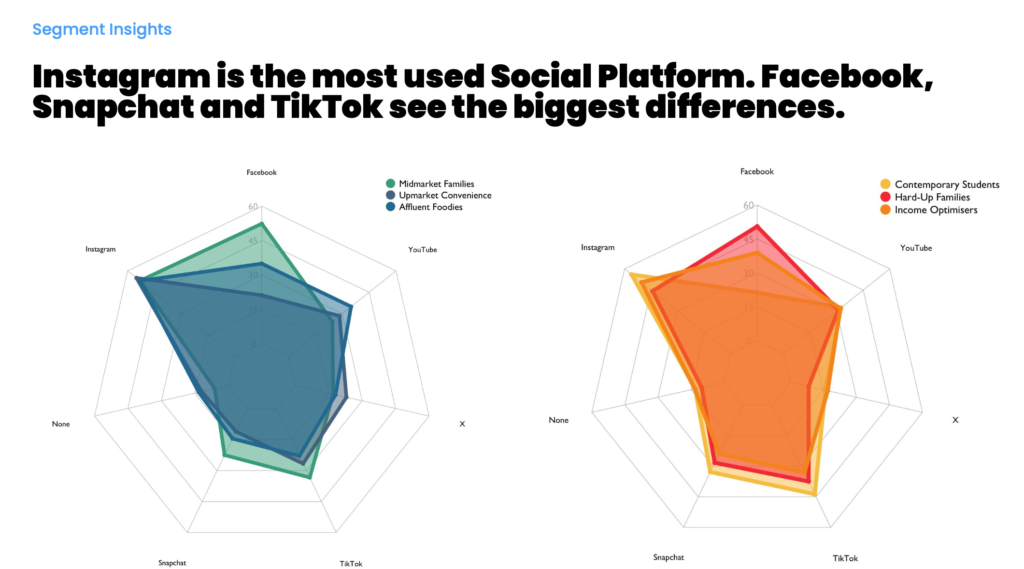
The following are some example ‘Business Stories’ with the above Good Chart guide in mind for a Consumer Segmentation Overview:
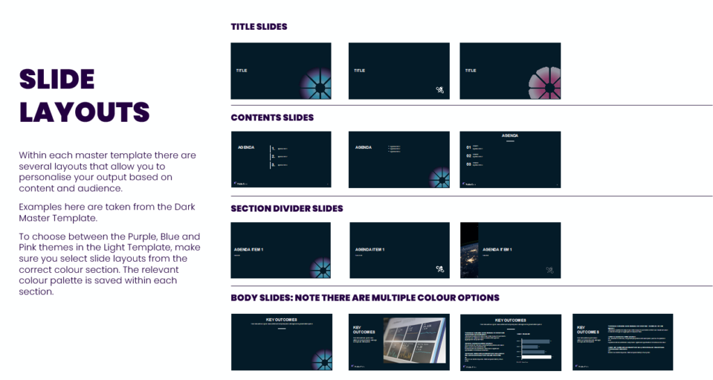
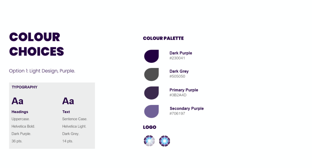
4 Presentation Stories
To increase the professionalism and style of a team’s outputs, it’s key that everyone is working to the same design principles. To help a previous client with this, I collaborated with them to create a PowerPoint template and style guide to allow them to raise their storytelling game. I also delivered a logo redesign using Adobe Illustrator and outlined the principles of how their charts should be arranged and designed.
